
Before I even talk about whether I’m looking for a buy or sell on EURUSD, let me say this first…
I am not in a rush to trade this pair right now.
And the reason is simple.
EURUSD is sitting in a range, and when price is in the middle of a range, that is usually where traders get themselves in trouble. The middle is where emotions start talking. The middle is where traders start guessing. The middle is where people say, “Well… it looks like it might…” and that sentence alone has probably blown more accounts than bad spreads ever did.
So for me, this is not a “jump in now” chart.
This is a wait for the market to come back to my level chart.
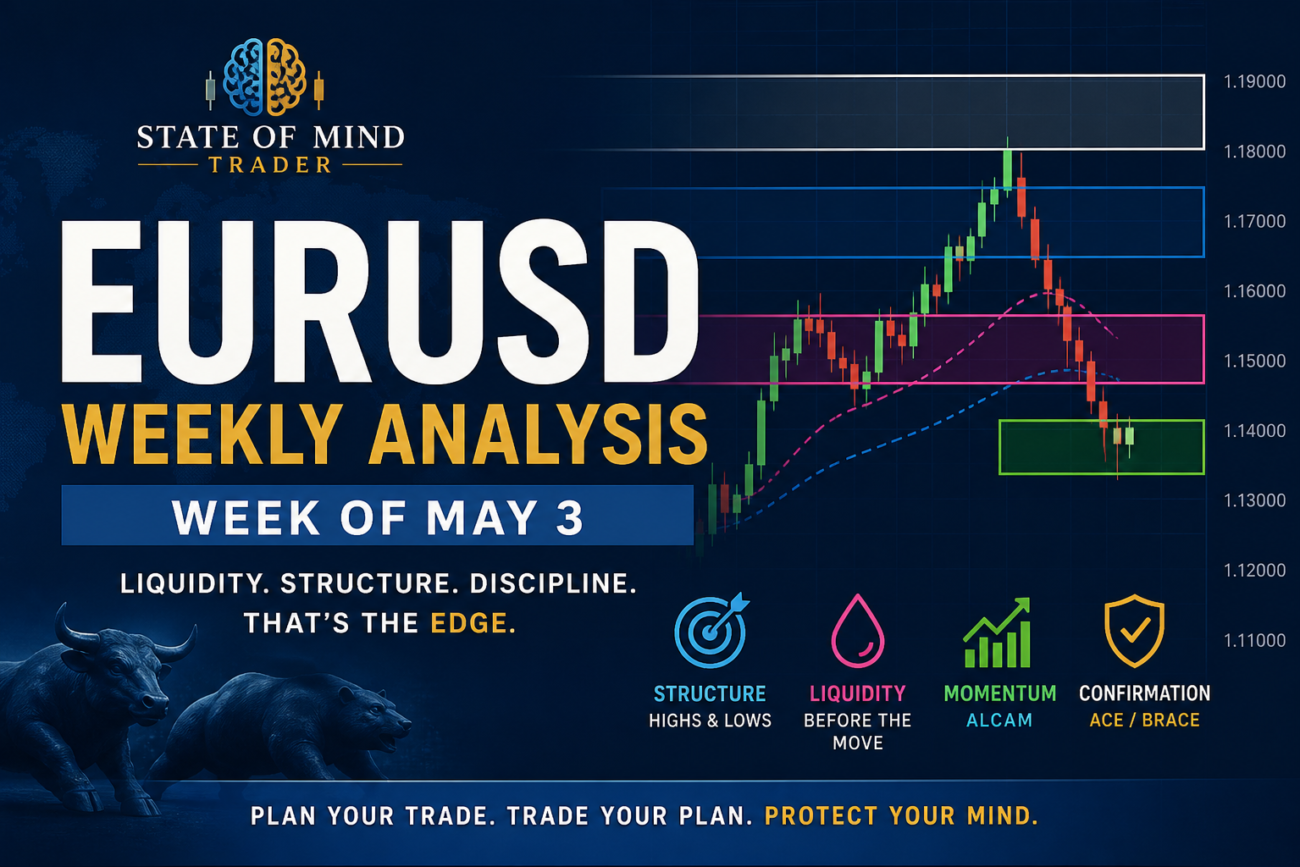
First, Let Me Explain My Chart Markups
Because if you are new to how I mark up my charts, the boxes matter.
They are not just colors on the screen. They tell me where price has been, where price is reacting, and where liquidity may be sitting.
Here is how I use them:
- Green boxes represent my 1-hour structure (previous day high and low)
- Pink boxes represent my 4-hour structure (previous week high and low)
- Blue boxes represent my daily structure (previous month high and low)
- White boxes represent my monthly structure (previous year high and low)
The Daily Chart: Don’t Ignore the Bigger Battlefield
On the daily chart, EURUSD is sitting inside a larger structure.
Price already pushed into the top of the blue box (previous month’s high) and rejected. That alone tells me we hit a premium area where sellers were willing to step in.
But here’s what I don’t want you to miss…
There is also a white box visible on this chart.
That white box represents the previous year’s high and low, which means we are operating inside a much larger structure than you may realize.
So when price reacts near the top of the blue box inside that white box, I’m not just thinking short-term.
I’m thinking:
“We’re at a higher-timeframe decision point… but we still need confirmation.”
That’s the difference between marking charts and actually reading them.
Right Now, EURUSD Is in No Man’s Land
Even with that rejection, price is not sitting at the best sell location right now.
It’s in the middle.
And I don’t trade in the middle.
Because the middle of the range is where you can be right about direction… and still lose the trade because your entry was poor.
So instead of forcing something, I wait.
If price wants to drop from here, that’s fine.
But I’m not chasing it.
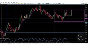
The 4-Hour Chart: This Is Still a Range

When I drop down to the 4-hour chart, price is clearly moving in the middle of this range.
That tells me one thing:
👉 This is still a range.
Yes, price rejected from the top—but that alone is not enough for me.
This is where my discipline comes in.
For my highest-probability setups, I want to see stochastic come back into overbought on the 4H and align with the 1H before I even consider a sell.
That rule has been working for me, and I’m not changing it.
The 1-Hour Chart: Liquidity Is Still Sitting Above the Highs
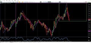
Now this is where things start to make sense.
On the 1-hour chart, we already saw:
- A push into the highs
- A rejection
- A move lower
But I’m not interested in that move.
Because there is still liquidity sitting above those highs.
And if you’ve been trading long enough, you already know what that means…
- Price may come back up
- Retest or take those highs
- Then make the real move
Most traders see resistance.
I see liquidity.
And I would much rather wait for that liquidity to be taken before I get involved.
My Entry Model (ALCAM + ACE or BRACE)
So when price comes back into that area, this is where my process kicks in.
I’m not just looking for price to touch a level.
I’m looking for alignment, location, confirmation, and momentum, what I call ALCAM.
If you’re not familiar with that yet, I highly recommend going back and reading that breakdown, because it explains exactly how I filter my trades and avoid low-probability setups.
From there, my entries come from either my ACE or BRACE models.
- With ACE (Assess, Confirm, Execute), I’m stepping in after I see a clean reaction and confirmation
- With BRACE (Break, Retest, And Confirm Entry), I’m waiting for structure to break first, then entering on the retest
If you haven’t gone through those yet, take the time to read them. It will help you understand why I wait the way I do—and why I don’t rush trades.
My Plan for EURUSD This Week
Here’s exactly what I need to see before I even think about entering a sell:
- Price pulls back into a premium area — this may include a Fibonacci level (especially near the 71%) if price reacts early
- That level aligns with structure — preferably the green (1H) or pink (4H) box
- Both the 4H and 1H stochastic are in overbought conditions
- Price shows clear rejection and fails to hold above that structure or liquidity zone
- Momentum shifts downward with confirmation
And that last part is key…
Because that’s where I’m not guessing.
That’s where I’m relying on either my ACE or BRACE entry model to actually trigger the trade.
If you’ve studied those models, then you already know—I’m not entering just because price “looks like it’s turning.”
I’m waiting for the market to prove it.
If I don’t see all of that come together?
👉 I wait.
Right now, EURUSD has already made an initial move down, but it has not come back into my ideal sell location yet.
And with liquidity still sitting above the 1-hour highs, I would not be surprised at all to see price revisit that area first.
So for now?
👉 I am not selling
👉 I am waiting