
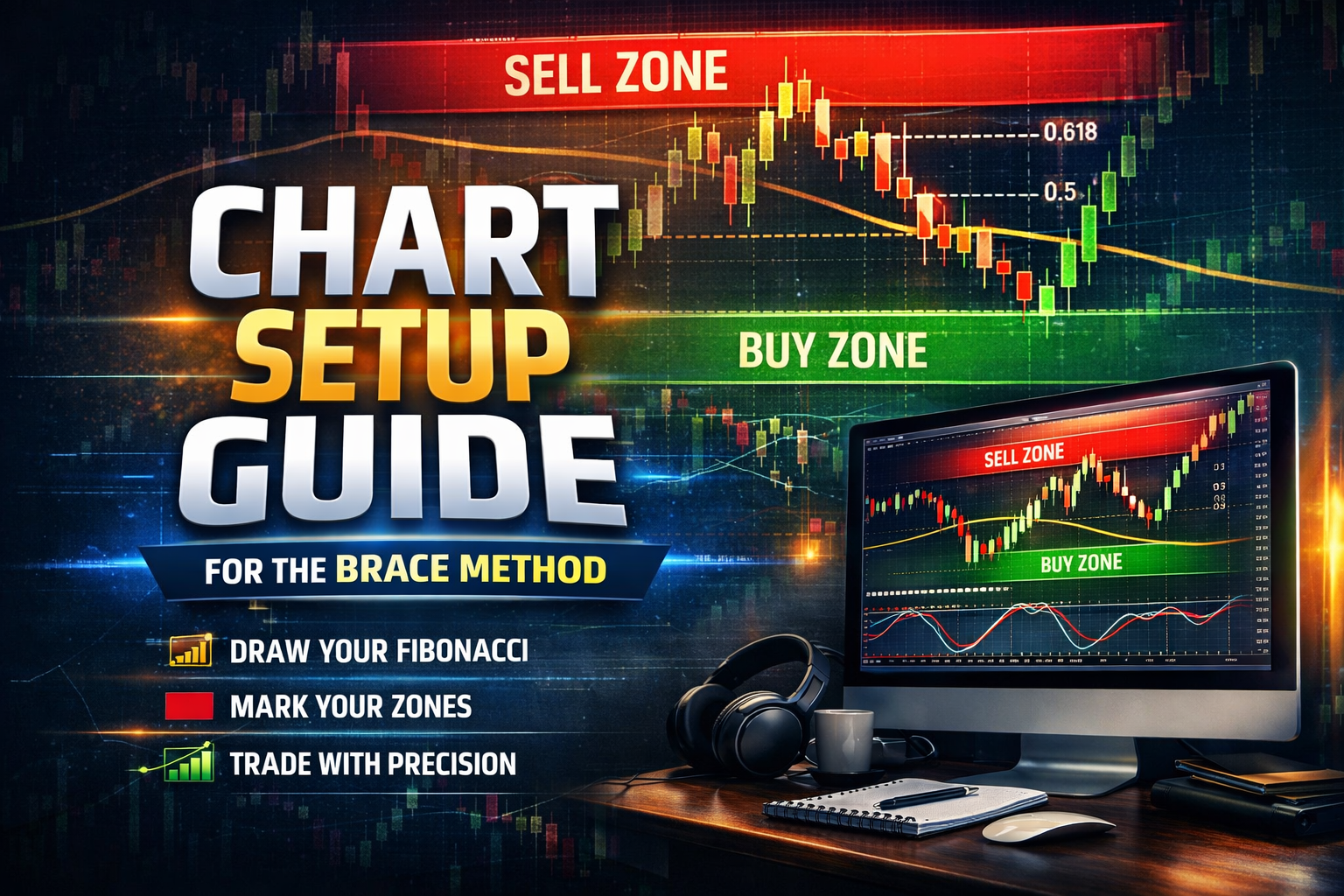
Chart Setup Guide (Heat Map Method)
How to Build a Clean, Powerful Trading Chart Using Weekly Fibonacci Levels
If you want to trade my strategy effectively, your chart setup is not optional—it’s required.
This system is built around price location, not indicators.
And the foundation of that location is your Weekly Fibonacci Heat Map.
Once this is set up correctly, you’ll always know:
- Where price is expensive (premium)
- Where price is cheap (discount)
- And where your high-probability trades live
Let’s build it step by step.
🔹 Step 1: Start With the Weekly Chart
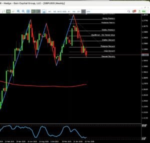
Your entire framework begins on the Weekly timeframe.
Using GBPUSD as an example, your job is simple:
👉 Identify the most recent major swing high and swing low for 2026
- Swing High → highest point reached in the current cycle
- Swing Low → lowest point before the move upward
⚠️ This must reflect current market structure, not something outdated from last year.
Once identified:
- Draw your Fibonacci from high to low (for bearish structure)
- Or low to high (for bullish structure)
This becomes your market map.
🔹 Step 2: Apply the Custom Fibonacci Levels
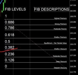
Now we turn Fibonacci into a precision heat map, not just random lines.
Use these exact levels:
0.886 → Strong Premium
0.786 → Moderate Premium
0.618 → Shallow Premium
0.500 → Equilibrium (Fair Market Value)
0.382 → Shallow Discount
0.236 → Moderate Discount
0.126 → Deep Discount
0.000 → Deepest Discount
This is not negotiable—this structure defines your edge.
👉 The 50% level is your dividing line:
- Above = Premium → Look for sells
- Below = Discount → Look for buys
🔹 Step 3: Turn It Into a Visual Heat Map (This Is the Game-Changer)
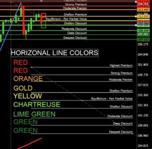 Now we make your chart readable at a glance.
Overlay horizontal lines using this exact color system:
🔴 Premium Zone (Sell Territory)
- Red → Highest Premium
- Red → High Premium
- Orange → Moderate Premium
- Gold/Yellow → Shallow Premium
⚖️ Equilibrium
- Yellow → 50% (Fair Market Value)
🟢 Discount Zone (Buy Territory)
- Chartreuse → Shallow Discount
- Lime Green → Moderate Discount
- Green → Deep Discount
- Dark Green → Deepest Discount
👉 This turns your chart into a true heat map:
- Red = Danger to buy (look for sells)
- Green = Opportunity to buy
- Yellow = Decision zone
Now you don’t “analyze”… you see.
🔹 Step 4: Drop Down to the 4H Chart (Execution Layer)
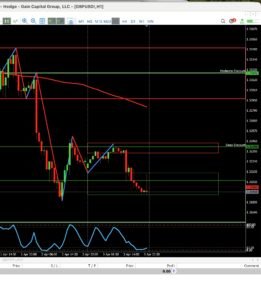 Once your weekly heat map is complete, you move to the 4-hour timeframe.
This is where structure and execution begin.
On the 4H chart:
- Keep all your weekly levels visible
- Do NOT redraw Fibonacci on lower timeframes
- The weekly levels control everything
Now add:
🔲 4H Zones (Primary Structure)
- Solid boxes = 4-hour buy/sell zones
- These are your main areas of interest
🔹 Step 5: Overlay the 1H Zones on the SAME Chart
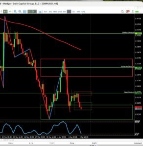 This is where you leveled up your workflow.
Instead of switching charts, you now:
👉 Combine both timeframes into one view
🔳 1H Zones (Refinement Layer)
- Thin red boxes = 1H sell zones
- Thin green boxes = 1H buy zones
These sit inside or around your 4H zones.
This gives you:
- 4H = Direction and structure
- 1H = Precision and timing
🔹 Step 6: Eliminate the Daily Fibonacci (Yes, It’s Gone)
This is important.
You are no longer using the daily Fibonacci.
Why?
Because:
- The weekly already gives you the full market range
- Adding daily levels creates noise and conflict
- Your system works best with one clear source of truth
👉 Weekly controls bias
👉 4H + 1H control execution
Simple. Clean. Effective.
🔹 Step 7: What Your Chart Should Tell You Instantly
When your chart is set up correctly, you should be able to answer this in seconds:
- Where is price located?
- Premium? → Sell mindset
- Discount? → Buy mindset
- Am I in a key zone?
- 4H zone = opportunity
- 1H zone = entry refinement
- Is this aligned with the heat map?
- If not… skip the trade
🔥 Final Thoughts (This Is Where Most Traders Mess Up)
Most traders clutter their charts with indicators hoping for clarity.
You did the opposite.
You removed noise and built a system that shows:
- Location
- Structure
- Timing
All on one chart.
That’s how professionals think.
⚠️ Non-Negotiable Rule
If your chart is not set up like this…
👉 You are not trading this strategy correctly.
No shortcuts. No guessing. No “close enough.”
Set it up right—and the market starts making a whole lot more sense.